Monday, 27 February 2017

Digipak Ideas- Magazine Advert


To go with our CD cover, me and my group have to also design a magazine advert which advertises our artists tour dates which tie in with the upcoming album. Similar to our CD cover idea we wanted to stay in the theme of our music video for the same reasons, that our audience will be able to recognise that it's for the song 'Chandelier' and our music video. Our original idea for the magazine advert was to have a picture of colourful graffiti on a blank wall, the reason for this is because in the music video our dancer is dancing around in an abandoned building which has bright graffiti all over the walls. However, we've started to move away from this idea because we thought it wouldn't represent our music video as much as we wanted and the song is very emotional and graffiti doesn't represent much or any emotion. This Coldplay magazine advert is similar to how we would've done our orignal idea because it's graffiti but also in UV paint, which relates to both parts of our music video; abandoned building and close up of Phoebe's face using UV paint. 

We then researched some artists and their magazine adverts for some inspiration and ideas. The two which stood out for me and my group was Sia's magazine advert for the 'Chandelier World Tour' and Lady Gaga's 'Applause' poster. Sia's poster stood out because it's so simple yet effective because of the dark lighting and everything being in black & white. If we decided to go with this type of magazine advert we would use our dancer in the picture because i feel like by her doing an impressive dance pose it'll help the magazine advert stand out and bring in the elements of emotion but also dance. Secondly, Lady Gaga's magazine advert is very similar to some of the themes in our music video. She has colourful paint all over her face and like in our music video she has paint below her eyes like tears and smudged paint, like lipstick, on her lips. We would take a close up image of Phoebes face, using the UV paints and imitating the paint marks she makes in the music video for the picture. 

Monday, 30 January 2017

Digipak Ideas- Rihanna


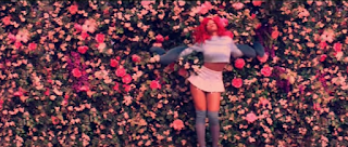
Rihanna's digipak for her 'Loud' album is a good example of a successful digipak because it's eye catching, follows a continuous theme and well made. The audience will be able to tell that this album features the song 'Only Girl in the World' because in the music video it's got the same edit over the tip with the hue's of navy blue and lots of reds and pinks. The music video also features a red wall of roses which is on the digipak too.  
Me and my group thought this was a good example of a digipak because this has the conventions which we're looking to use, the theme and making it easy to know who the ablum is by and what single is on the album. However, on our digipak we'll only have 4 sections and  have the song titles on the back. 


Sunday, 29 January 2017

Digipak Ideas- Starboy

Starboy is the Weeknd's new album. We decided we wanted to do the same as what he's done and relate the CD cover to his most popular song and it's music video. 

The themes which are in both the cover and music video, is the featuring of a cross, he carries a glowing one around with him in the music video whilst wearing the same one he has on in the cover. He's also wearing the same leather jacket in both too. They've even used the same sort of lighting, in both it's quite a low light with a hint of blue. As an audience you can feel/see the same mood between both by his facial expression and the lighting, in both he look's very serious and maybe you could say annoyed also. I think this looks effective because it shows the audience a clear theme throughout his album and they'll be able to recognise that it's his song/album through the particular themes. 


Another example of him carrying along the theme, is in his other song's music video; Party Monster. Again he's wearing some sort of leather jacket, with blueish lighting & it features a cross throughout.


Digipak Ideas- CD


Before beginning to create our digipak, me and the group discussed what ideas we could do for the CD cover & we all agreed on using colour powder paints or neon paints on our actor/s because it links with our music videos theme but also looks effective. We thought it was important to stick with the theme of our music video because the  viewers will be able to tell the CD is for our music video. 


Monday, 23 January 2017

Development of Idea on Feedback

Because the feedback we got from our peers and teacher suggesting to film more extreme closeups of our actors face to show emotion, we've come up with the idea of using neon paints on Phoebe's (actor) face and hands to still go with the theme of her partying and the disco lights. We'll also use the paint to represent messages, for example, we'll have her smudge it below her eyes like she'd been crying or have her drag her hand down her neck like she's been strangled. 


 We took these test shots of using the neon paints on our hands and putting them next to the UV light to see what it looked like on the camera to see if we liked it. When looking back at the pictures we then came to the conclusion that we're defiantly using this idea because the paint shows up really well on the camera and we think it'll be effective in our music video. 


Me and the rest of the group wanted to do something with neon paint but coming up with the idea & to see if we think it would work we watched 'Super Bass' by Nicki Minaj which at the end of her video features her and some dancers all in glow up outfits and makeup. After watching the video, we thought it looked cool and we then decided we wanted to use the paints, however, even though we used Super Bass as inspiration we'll be using the paint in a different way and for it to represent different meanings because the context of both of the songs are completely opposite from one another. 


Monday, 9 January 2017

Feedback on Rough Cut

Once we had our rough cut of our music video finished, we pre-viewed it to our teacher and peers to receive their feedback and to help us develop our music video further. This was their feedback: 


  • Teachers feedback- He said our ideas and what we already had was good and had potential but due to lack of camera shots and emotion it came off as boring and slow paced. He suggested to watch the Miley Cyrus 'Wrecking Ball' music video to give us inspiration on what to add to ours. At the start of the music video it was an extreme closeup of her face and she was crying whilst miming the lyrics for 30 seconds and this gave emotion and drew us in to watch the rest. 
  • Peers feedback- More variety of different shots, for example; extreme close ups. 
Overall the feedback we got from our peers and teacher shows that we defiantly need to do some more filming and the content we will need to film is close ups and extreme close ups of our actors face to show the emotions of the song, which will add more depth to the music video but also make it less 'boring'.